The Perot Family's New Corporate Headquarters: A Powerful Collaboration Between Architecture and Landscape

The new headquarters for the Perot family businesses represents both the family legacy and an investment in the well-being of their employees.
THE MARQUEE headquarters being built today, including Apple’s and Facebook’s, are designed specifically to foster collaboration and emphasize outdoor spaces for employee health and wellness. Apple’s immense glass ring of a building has a 30-acre park at its center, while Facebook’s has a 9-acre rooftop park, complete with walking trails.
But headquarters on a smaller scale can also be similarly optimized. A prime example is the recently completed Perot family corporate campus in Dallas. Designed by Mithun, the high-performing 185,000-square-foot building brings together 300 employees from nearly a dozen different businesses under one roof and offers seamless integration between inside and outside.

The business enterprises of the well-known Texas family, which include real estate development company Hillwood and nine others (see “Perot Family Business Units” at left), had offices in several locations across Dallas as well as in suburban Plano. The three generations of family represented in these enterprises wanted to bring the various businesses together to encourage cross-pollination and make it easier to share ideas. They also wished to highlight the legacy of Ross Perot, the well-known businessman and former presidential candidate. The headquarters needed to be a physical manifestation of the family’s values, which include a sense of shared teamwork and the importance of relationships in building a successful business.
“The building serves as a powerful symbol of who we are and how we approach relationships and doing business,” says Ross Perot Jr., the CEO of Hillwood. “We wanted to build a highly collaborative, healthy building for tomorrow’s generation of leaders that could shape and reinforce our culture.”
Due Diligence
To determine the key requirements for their headquarters, family members toured a number of corporate campuses, including those of Goldman Sachs, the Bill & Melinda Gates Foundation, Google and Pixar. They were especially inspired by Main Street at Pixar headquarters, where employees enter the building at a central hub that is the heart of the campus. Pixar’s Main Street includes a dining hall, restrooms, central stairs and a movie theater; it brings people out of different parts of the building, so they can meet with others and share ideas.
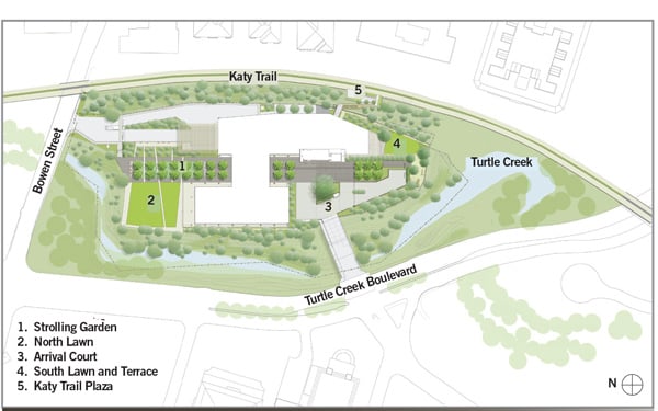
The Perot family also made a concerted effort to locate the building within a beautiful creek-side setting, to enable the workplace to connect to nature and its health benefits for employees. They picked a choice site, a 6-acre property located several miles north of downtown Dallas. Surprisingly verdant, given its close proximity to the urban core, the parcel is bounded on one side by Turtle Creek and Katy Trail, and by a popular bicycle/pedestrian trail on the other. Consolidating at this central location means the new headquarters building is both closer to the homes of current team members and more attractive to potential employees.

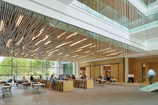
The central gathering space known as the “Intersection” contains a variety of places where employees can meet and collaborate, including this ground-floor cafe and dining area. Photograph © Bruce Damonte
To design their headquarters, the Perot family chose to work with Seattle- and San Francisco-based Mithun. The firm brought its experience working with Silicon Valley’s biggest names in flexible workspaces, allowing teams to form and re-form as needed and enabling both focused individual work and collaborative effort. Its multidisciplinary team was also well suited to the Perot family’s goals for this particular building.
“Of the groups we interviewed, Mithun was the clear winner, primarily because of the design concept they delivered,” says Perot Jr. “We liked how the building and surrounding grounds were incorporated and showcased the natural beauty of the site, and how they included landscape design as a part of the architecture team.”
Mithun’s integrated design team of architects, interior designers and landscape architects included two Dallas-based firms: architect-of-record BOKA Powell and collaborating interior designer Emily Summers Design Associates.
An Indoor-Outdoor Workplace
In contrast to the suburban corporate campuses of the 1960s and 1970s, where offices were surrounded by vast lawns, the design team, working with the clients, made sure that the landscape was an integral part of the building complex. Their plan placed all parking below grade and called for a three-story, concrete-frame building of 185,000 square feet, just 20 percent of what could have been built on the site. While the site was zoned for up to 1 million square feet and a height limit of 240 feet (18 stories), the family’s goal wasn’t to maximize the size of the building. Rather, they wanted the building to blend into the treetops and take full advantage of the lush creek-side property.

Located several miles north of Downtown Dallas, the 6-acre project site is bounded on one side by Turtle Creek and on the other by Katy Trail, a popular bicycle and pedestrian trail.
Research confirms that exposure to nature can result in a measurable reduction in stress levels and improvements in health. Limiting the building’s height to three stories helped create a healthy workplace in two ways. It encourages employees to spend time outside by making it easier for them to step out for a break or hold a walking meeting. It also encourages them to use the stairs instead of the elevators, which are discreetly tucked away, since employees have only a few floors to traverse.
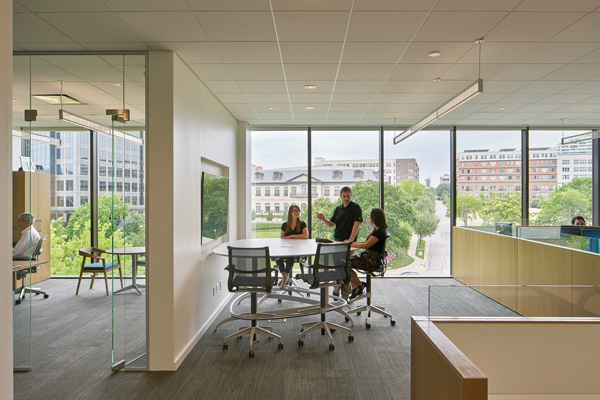
To bring the outside in, a glass curtain wall around the perimeter provides visual transparency as well as maximum daylight. Views into the surrounding tree canopy create a sense of being part of the landscape, which can materially enhance well-being. A 2003 study by Heschong Mahone Group found that customer service representatives with seated access to views of the outdoors experienced a 6 to 7 percent increase in productivity.
The abundant use of natural materials in the interior design also heightens the indoor-outdoor connection. Oak, a native wood, is the predominant species used for everything from the wood-slat ceilings and wide-plank floors to the treads of the central staircase. The lighting also helps reiterate the subtle patterns of nature. The dining area’s ceiling of wood slats with integrated LED lighting is designed to mimic the dappled light that comes through the trees outside.

Glass-walled conference rooms and offices draw in daylight and offer a variety of workspaces. Photograph © Bruce Damonte
The campus is designed with an extensive series of outdoor spaces that serve as informal meeting areas and offer Wi-Fi service. Taking hot Texas summers into consideration, the design team minimized the contrast between interior and exterior, avoiding the extremes between a cool, darker indoor space and a brighter, harsh outdoor one. Outside the ground-floor cafe, mature trees and the building’s portico shade a dining terrace, while a water feature that emulates the ebb and flow of Turtle Creek provides a cooling effect. A series of gardens and lawns draws people to edges of the site to enjoy the creek’s natural beauty.
The east side of the building is set next to the Katy Trail, creating an intentional connection and providing an alternative to conducting business in a conference room. A bridge to the trail from the building makes it convenient for employees to bike or walk to work. Because the trail is so visible from the building, those inside see community members jogging, walking their dogs and cycling, and are reminded to get outside and be active. A yoga room and fitness center also face the trail.
While the building is targeted to LEED Silver certification, its outdoor areas also contribute sustainable strategies. A 100,000-gallon cistern collects stormwater that is used to irrigate native plants, and rainwater runoff from the arrival plaza is captured in a bioretention cell that slows and filters the water before discharging it into Turtle Creek.
Making Connections
In addition to creating connections to the outside, the headquarters design connects employees to one another. The most appealing spaces in the building are designed to be shared by the entire team. In a survey taken a few months after they moved in, an overwhelming majority of employees agreed that the building facilitates collaboration and communication.
The heart of the building is the “Intersection,” a transparent circulation core that connects the two wings of the building. The 5,550-square-foot hub holds the building’s central open staircase and also doubles as an event space for community and charity events. The in-house cafe featuring healthy options and a shared dining area brings people together at the base of the central staircase.
In lieu of separate meeting rooms and break rooms for each of the 10 business units, amenities are centralized around this circulation core, promoting a “stair culture” that prioritizes opportunities for chance encounters and unplanned interactions among employees, as well as cross-collaboration among the various businesses. Nearly 45 percent of the building is shared space, and this space intentionally includes circulation with adjacent spaces to create a Main Street atmosphere.
The entry sequence is also designed to encourage impromptu connections. Whether they are coming from the main entry court or the parking garage below, all visitors and employees arrive at the “front door.” Here, a reception desk, made of live oak salvaged from the site, greets all visitors.
Balancing Flexibility and Autonomy
The offices themselves were designed to accommodate the needs of each business unit, providing choice and variety to support individual work styles, collaborative work and focused work. Since each business unit is an autonomous company, it was important to Perot Jr. that each had the ability to customize its own office space.

Mithun worked closely with the leaders of each business unit to discuss how they worked in order to design spaces that met their unique needs. Through in-person iterative discussions, focus groups and information gathered on forms, the design team determined necessary adjacencies, equipment needs and which business groups had high-growth potential.
The result was a mix of open, enclosed and hybrid workspaces. The hybrid workspaces, which became known as “boat slips,” are enclosed on three sides but open facing the team area, to facilitate collaboration. (Hillwood Investments and Hillwood Construction Services had used these hybrid workstations at their previous location.) The majority of workspace in the building is enclosed or hybrid, reflecting Perot Jr.’s vision to provide focus space for the team to do their best work.
The workspaces are based on a modular grid that will accommodate changing needs. Designers carefully studied each business unit to understand its growth needs and the likelihood of changes driven by market forces or acquisitions, for example. Each business group occupies contiguous space on a single floor. Flexibility was built in by including space between groups, enabling them to grow in one direction or another.
Workstations throughout the building are comprised of the same modular office system, balancing needs for customized arrangements while easily accommodating future moves and rearrangements. Raised floors also promote flexibility, with access to electrical and data cabling contained in a space between the concrete slab floor and the office floor a few inches above. Within the grid system, walls can be easily removed or added, to create a conference room or two adjacent offices.
While the new Perot family headquarters is located on a unique site for such an urban setting, its design approach could be applied to many corporate campuses. By adhering to several guiding principles – connectivity to nature and fostering collaboration – the building supports a healthy, productive company culture that reflects the family’s mission and values, and should prove a worthy long-term investment.
Dave Goldberg, president and architect; Annie Rummelhoff, associate and interior designer; and Dakota Keene, associate principal and landscape architect, Mithun


